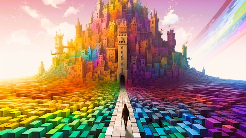
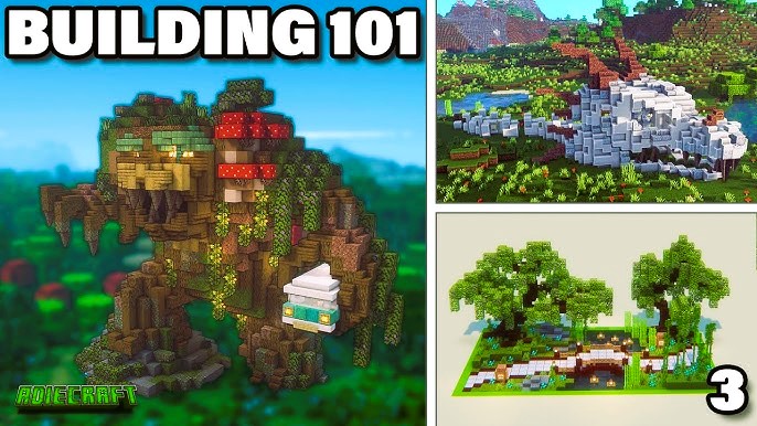
Minecraft, with its seemingly simple blocky graphics, provides a vast canvas for players to express their creativity. Beyond the structural intricacies and architectural designs, one often underestimated aspect plays a profound role in shaping the player’s experience—the psychology of color. In this exploration, we delve into how the choice of colors in Minecraft builds can significantly impact mood and atmosphere.
Understanding Color Psychology
Color psychology is the study of how colors can influence human emotions, behavior, and perceptions. Different colors evoke distinct emotional responses, and understanding these associations is crucial when designing virtual spaces in games like Minecraft. While the game’s visual simplicity may suggest limited possibilities, the strategic use of colors can enhance the player’s experience and create immersive environments.
Warm vs. Cool Colors: Crafting Atmosphere
In the world of Minecraft, warm and cool colors play a pivotal role in establishing the atmosphere of a build. Warm colors, such as reds, oranges, and yellows, tend to create a sense of warmth, energy, and vibrancy. These hues are often associated with positive emotions and can make a build feel inviting and dynamic.

Conversely, cool colors like blues, greens, and purples evoke a sense of calm, tranquility, and serenity. These colors are often used to establish a more relaxed and contemplative atmosphere in Minecraft builds. The choice between warm and cool colors can dramatically influence the player’s emotional response to the virtual space they are exploring.
Monochromatic vs. Contrasting Color Schemes: Visual Impact
The arrangement of colors within a build also plays a crucial role in visual impact. Monochromatic color schemes involve using variations of a single color, creating a harmonious and cohesive look. In Minecraft, this can be achieved by exploring different shades and tones of a particular block, providing a visually pleasing and unified appearance.
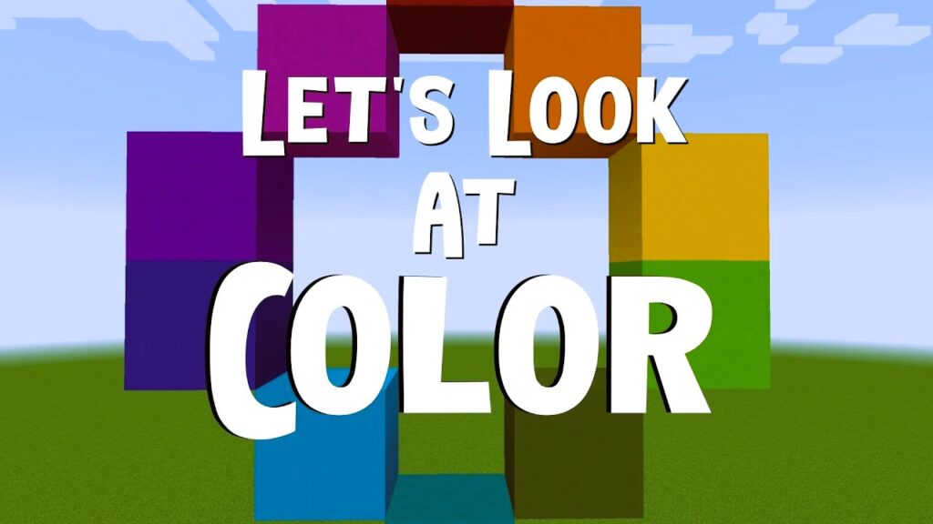
On the other hand, contrasting color schemes involve combining colors that are opposite each other on the color wheel. This approach can create a dynamic and attention-grabbing effect. Players often use contrasting colors strategically to highlight specific elements of their builds, adding visual interest and emphasis. Did you like the article? Read also about Building Minecraft with Biomes.
The Impact of Biomes: Natural Color Harmonies
Minecraft’s diverse biomes offer a natural palette of colors that can be harnessed to create harmonious and contextually appropriate builds. Builders often take inspiration from the environment around them, incorporating the colors of the biome seamlessly into their structures. This not only enhances the realism of the build but also creates a connection between the virtual space and the in-game world.
For example, a build in a lush, green biome might utilize a predominantly green color scheme with accents of complementary colors, creating a visually cohesive and immersive experience. Understanding the inherent colors of different biomes allows players to integrate their builds seamlessly into the natural landscape.
The Subtle Power of Accent Colors: Adding Depth
In Minecraft builds, accent colors are those used sparingly to create focal points and add depth. The strategic placement of accent colors can guide the player’s gaze and draw attention to specific elements of the build. Whether it’s a vibrant flower bed in a garden or a contrasting doorway in a stone fortress, accent colors serve as visual cues, enhancing the overall aesthetics of the build.
The Influence of Lighting: Dynamic Color Changes
Lighting in Minecraft is not only functional but also contributes to the overall color palette of a build. Different light sources emit varying colors, and builders often use this to their advantage. The warm glow of torches, the subtle blue hue of sea lanterns, or the eerie purple glow of end rods—all contribute to the atmosphere and mood of a build.
Additionally, players can experiment with colored lighting by using stained glass or colored blocks to filter light, creating dynamic color changes within a build. This adds an extra layer of complexity to the psychological impact of colors, allowing players to craft unique and visually stunning environments.
Player Perception and Emotional Engagement

The ultimate goal of understanding the psychology of color in Minecraft builds is to influence player perception and emotional engagement. When exploring a well-crafted build, players are not only interacting with the virtual environment but also experiencing a range of emotions influenced by the choice of colors. A vibrant and colorful market square might evoke feelings of liveliness and excitement, while a serene, monochromatic garden could elicit a sense of tranquility and calm.
Community Trends and Color Conventions
The Minecraft community, known for its collaborative spirit, often establishes color trends and conventions. Whether it’s the use of specific colors for different purposes or the adoption of certain color combinations for specific themes, players draw inspiration from each other’s creations. Online platforms such as Reddit, Minecraft forums, and Discord servers dedicated to building provide spaces for builders to share their color palettes, seek feedback, and contribute to the evolving color conventions within the community.
In conclusion, the psychology of color in Minecraft builds goes beyond the visual aesthetics—it directly influences the emotional and immersive aspects of the player experience. From warm and cool color choices to monochromatic and contrasting schemes, builders can craft virtual spaces that evoke specific moods and atmospheres. Understanding the impact of biomes, accent colors, lighting, and community trends allows players to create truly immersive and emotionally resonant Minecraft builds.
For more information on Minecraft, color psychology, and community trends, you can explore the Wikipedia page on Minecraft Fandom for in-depth community insights and discussions.

